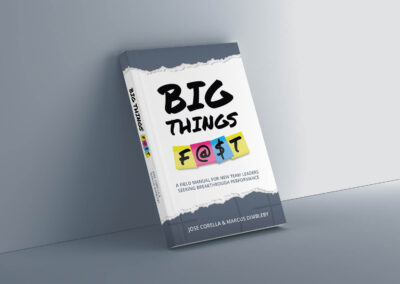
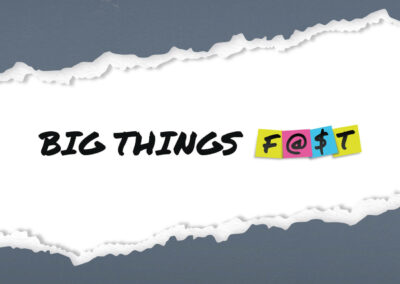
Big Things F@$t™
Big Things F@$t™ was created by Jose Corella, a transformative business leader. His insights equip new team leaders and managers with the tools and strategies they need to achieve extraordinary results.

The idea behind the look
In our fast-paced, ever-changing world, achieving incremental growth requires reflection and deliberate action. That’s why the Big Things F@$t™ brand features a handwritten font and sticky notes. These elements were chosen to inspire idea generation and represent the adaptability necessary for continuous self-improvement. Sticky notes can be quickly replaced or rearranged, allowing new ideas to emerge and take shape. By encouraging new team leaders to reflect and write down their goals one step at a time, the logo embodies the process of incremental, focused growth.

Before and after
Below, you can see the transformation of the Big Things F@$t™ website. The second screenshot shows the new look. The content of the website was also updated and reorganized to make it easier for the visitors to understand the message and take action.

Style guide
A style guide defines elements such as logo usage, typography, color palettes, and imagery styles to ensure that every visual element aligns with the brand’s overall vision and values. By providing a clear and concise framework for future design projects, the style guide ensures that every piece of visual content accurately represents the brand, building recognition and trust over time.
That’s why I created a comprehensive style guide for Big Things F@$t™, which you can see excerpts of below. This guide outlines the visual elements of the brand and explains how these elements help prospects go from realizing that the provided insights are useful to confidently applying it in their situation.


What Jose said about the work we did together

JOSE CORELLA
Transformative Business Leader
“Mariko is an outstanding and high-energy designer. She is highly collaborative and responsive; masterfully balancing design aesthetic principles, lateral thinking, and precise execution to elevate the visual identity and brand experience.
She was/is also an outstanding sounding-board and generator of ideas and provocations above and beyond the brief/contract.”
How we got to this result 🙌
Collaboration was at the heart of this project, and it was a pleasure to work closely with my client, Jose. Through multiple video calls and the use of the dynamic online tool Miro, we were able to ideate and create together. Our process began with research, analyzing Jose’s competitors and clearly defining his prospects. Together, we explored a variety of design concepts, ensuring we were in perfect alignment every step of the way before moving forward. This collaborative approach not only allowed us to create a resonating brand identity, but also established a trusting and productive relationship where we could build on each other’s ideas.